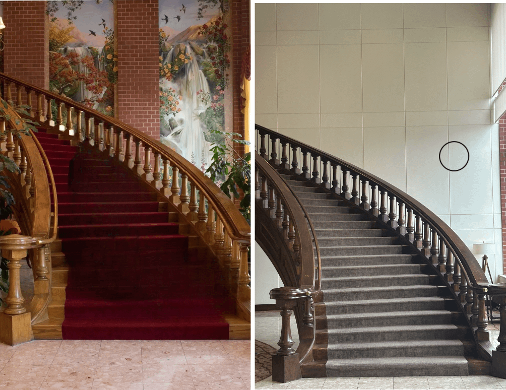
This is the Cornhusker Marriott in downtown Lincoln, Nebraska.
My parents met while working there in the 80s. Mom was in PR and dad was a bell boy. I was not conceived there but that hotel is the reason I exist. I got to stay there in 2009 and the lobby was beautiful. Damn shame they painted that wall white and removed so much of the wood.
As a millennial I hate how allergic we are to color.
And the thing is, I do like a simple, clean design. I like the millennial gray aesthetic! But it only works in contrast to other things. Like if everything is bright and colorful and noisy, having something look drab and basic makes it look classy. But if everything is designed that way then….everything is just drab and boring and it sucks.
 掲示板の反応


コメント
HUGE downgrade.
thanks i hate it
It reflects this timeline perfectly…
they ruined it
Why is everything like this?
This is the Cornhusker Marriott in downtown Lincoln, Nebraska.
My parents met while working there in the 80s. Mom was in PR and dad was a bell boy. I was not conceived there but that hotel is the reason I exist. I got to stay there in 2009 and the lobby was beautiful. Damn shame they painted that wall white and removed so much of the wood.
[Old lobby/staircase](https://www.usatoday.com/gcdn/media/USATODAY/hotelcheckin/2012/09/25/cornhusker-marriott-lobby-16_9.jpg?width=660&height=374&fit=crop&format=pjpg&auto=webp)
[New lobby/staircase](https://img.ctykit.com/cdn/ne-lincoln/images/tr:w-1800/cornhusker_staircase.jpg)
Perhaps the original owner died and the staircase is in mourning.
From magical regal fairytale to funeral home.
Who is this grey style impressing? Who is doing the survey’s saying this is what is needed.
Even Disney is going down this way of random greyness instead of theming which they are known for.
r/mildlyinfuriating
Modern means look plain and boring.
Lotsa corporate paint choices there.
Mmm that Millennial Gray staircase runner. Guess they must be trying to flip the place.
That’s infuriating.
2025 Sucking the life out of everything.
As a millennial I hate how allergic we are to color.
And the thing is, I do like a simple, clean design. I like the millennial gray aesthetic! But it only works in contrast to other things. Like if everything is bright and colorful and noisy, having something look drab and basic makes it look classy. But if everything is designed that way then….everything is just drab and boring and it sucks.
From color to gray. Updated can have color
Same as Cracker Barrel, they continue the downwards spiral into a generic looking future.
At work, one of the floors had cool original 70s wood paneling. They just ripped it all out and put drywall in, and now it looks like everywhere else.
The modern one is too dull, the older one too busy. Perhaps a happy medium could be achieved?
Minimalism SUCKS
should belong into r/mildlyinfuriating

Wouldn’t surprise me if they put the white paneling directly over the bricks and art.
The lobby was prone to softlocking so they added more portal surfaces.
Both are trash
I won’t lie, I don’t love the original look.
But I fucking hate the new look.